Solution:
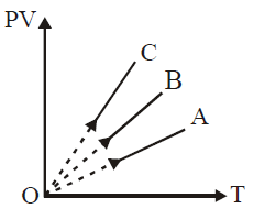
To analyze the \( PV \) versus \( T \) graph for gases of equal mass, we can use the ideal gas law and the fact that for equal masses of different gases, the number of moles \( n \) varies inversely with the molar mass \( M \) of each gas.
1. **Ideal Gas Law**:
\[
PV = nRT
\]
For a given temperature \( T \), \( PV \propto n \). Thus, \( PV \) will be larger for gases with more moles (i.e., smaller molar mass).
2. **Order of Molar Masses**:
- \( H_2 \): Molar mass = 2 g/mol
- \( He \): Molar mass = 4 g/mol
- \( O_2 \): Molar mass = 32 g/mol
Since equal masses are used, the number of moles \( n \) will be highest for \( H_2 \), followed by \( He \), and lowest for \( O_2 \).
3. **Conclusion**:
- Line with the highest \( PV \) value corresponds to the gas with the highest number of moles, i.e., \( H_2 \) (line **C**).
- The middle line corresponds to \( He \) (line **B**).
- The line with the lowest \( PV \) value corresponds to \( O_2 \) (line **A**).
Thus, **C corresponds to \( H_2 \)**, **B to \( He \)**, and **A to \( O_2 \)**.
Leave a Reply